Web of Science: One Profile
Product Design


My Role
As lead designer on this project, I was the primary UX designer, coordinated and facilitated research, and managed the project timeline and schedule.
The Product
Web of Science is a product that has a history that predates the internet. The core of the product is a citation database but technology has allowed us to provide analysis of the data to help assess research findings, researchers, institutions, and departments around the world.
Publons is a profile product that helps researchers get credit for their peer review and publications.
The Result
A profile within Web of Science where researchers can manage their outward reputation within the Web of Science.


Design goals
Integrate the Publons profiling functionality to allow our users to seamlessly track and collect their research contributions in peer review, publications and citations.
Moving the product in the strategic direction of a more personalized experience.
A flexible design so that the profile offerings can continue to grow over time.
Project Discovery
Strategy: User interviews and past user research informed a strategic design direction for this project. This helped to align the team on the goals, set a vision for the product and give a clear idea of how the work would be done.
A few of the slides from the strategy presentation:


Design sprints: The design phase was done in two week sprint cycles. Each week had clear design goals, team check ins, and reviews.
Design sprint planning:
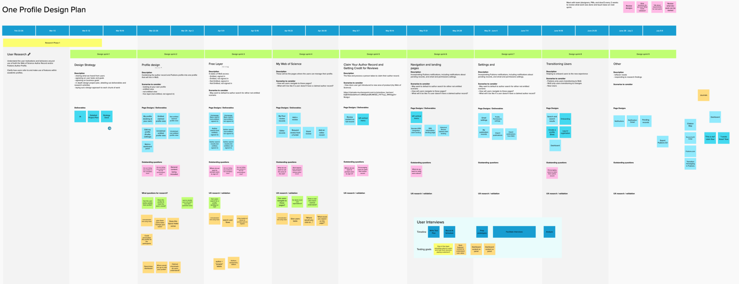
User research: Aside from the user interviews done to inform the strategy, several user research studies were done to test the high risk parts we were adding to the product. We used unmoderated testing tools and did 1:1 user interviews to gain confidence in our solution.
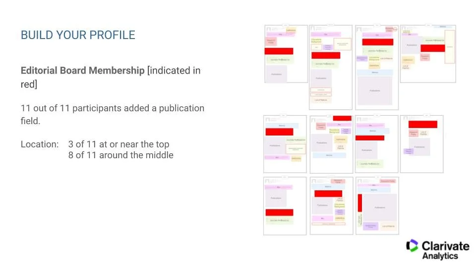
Output of card sorting/build-your-own profile activity with users:


Design updates
The evolution of the product is being broken down into a smaller phases of work. Here are a few of the more major updates that were made:
Product Navigation (left navigation): The core function of the product revolves around search. The menu in the header was slowly becoming a features list, adding a new navigation item for each new feature. Introducing a left hand navigation allowed us to focus the header on the search experience. The left navigation panel was focused on “My Web of Science” - a personalized experience based on who I am and what topics I am interested in.
Profile management pages: Allowing users to manage their profile, which contained lists of their research contributions, meant adding a lot of pages and functionality to the product that allowed them to easily do that.
Metrics dashboard: Viewing a researcher’s contributions can tell you a lot about them but it can be difficult to understand what it all means. We added a metrics dashboard to the profile, which helps users to evaluate the researcher and their work. We worked very carefully to design this so that we can start to even the playing field when it comes to researcher evaluation.
Expanding the profile: Before this, there were profile-like views of researchers and their publications. This project expanded how much information we have about a researcher by a lot. This meant an evolution of the profile design was needed to allow for a lot more content and to prepare for content that could be added in the future.
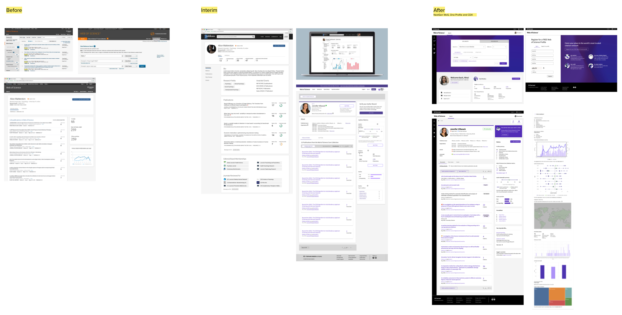
The 2 year evolution of the profile and the UI design of the product.